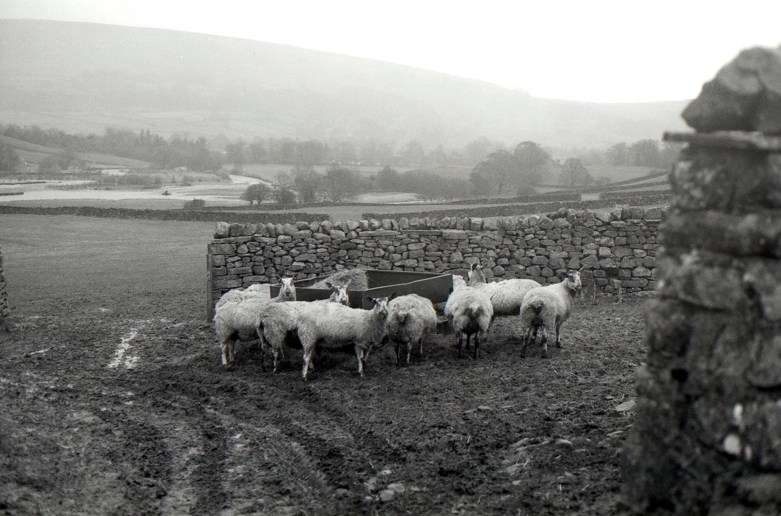
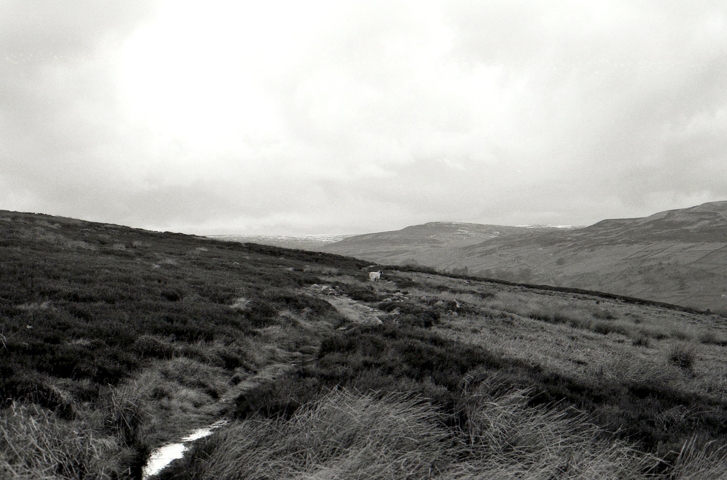
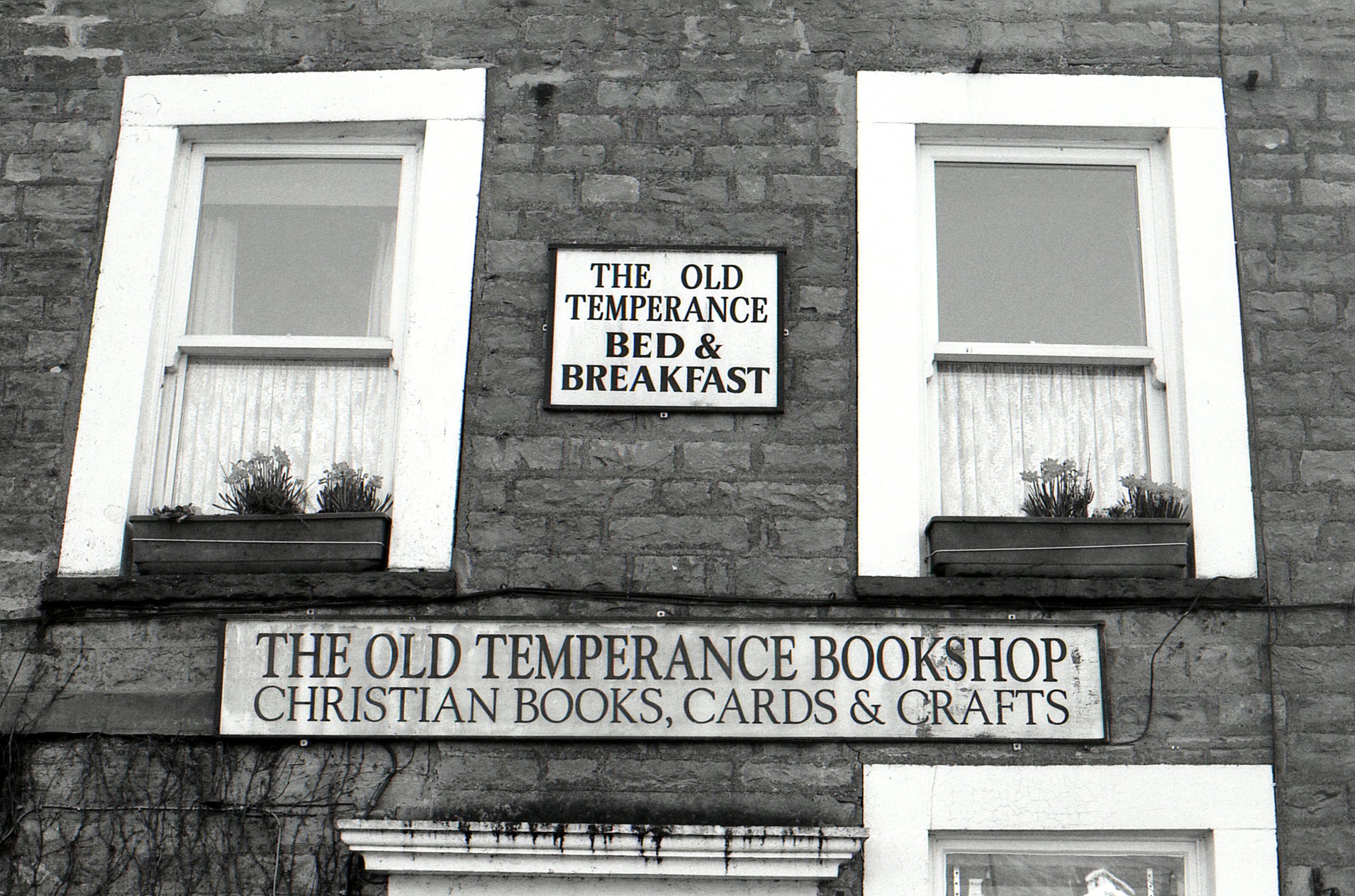
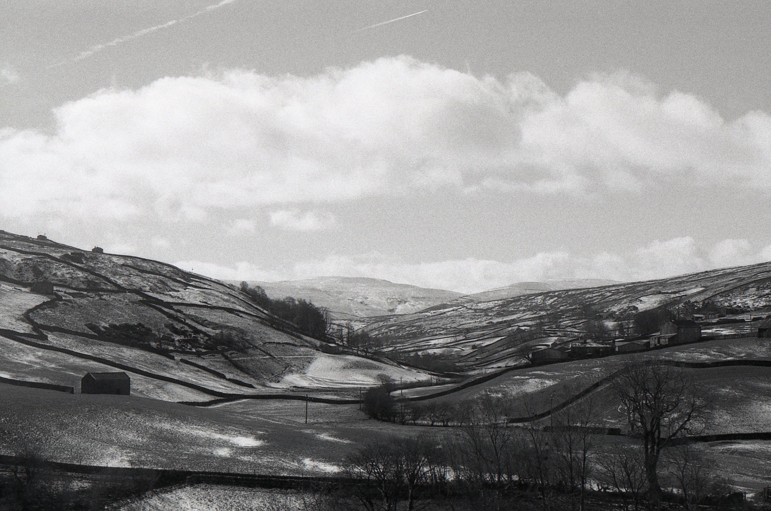
Lovely light in the Yorkshire Dales

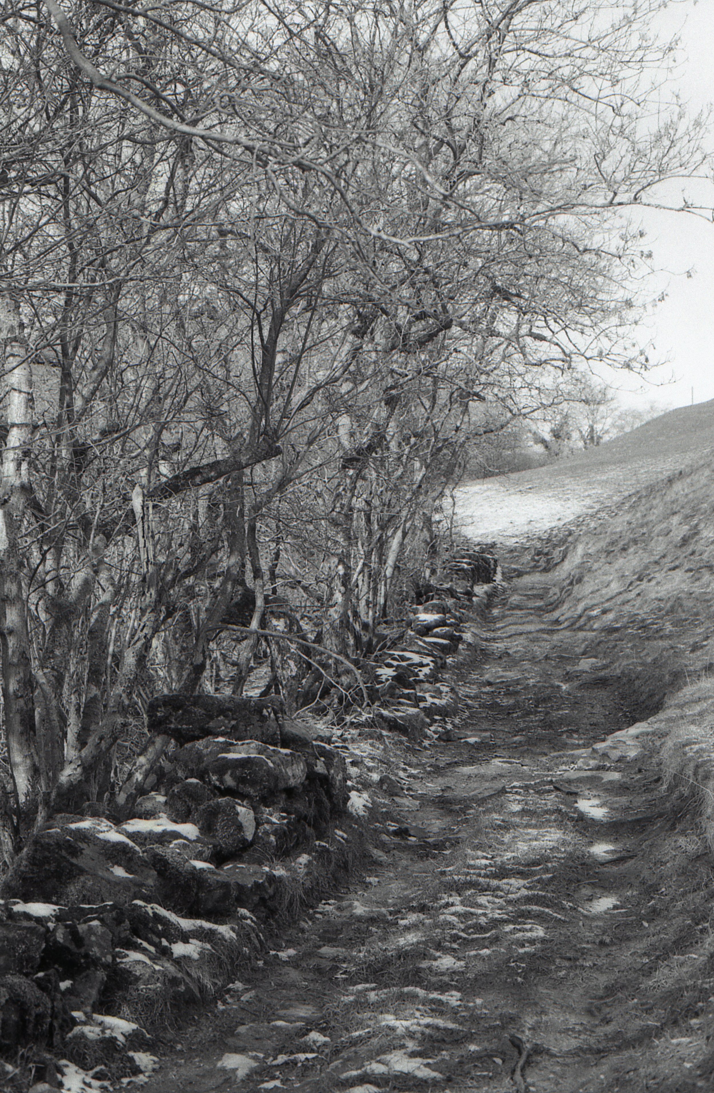
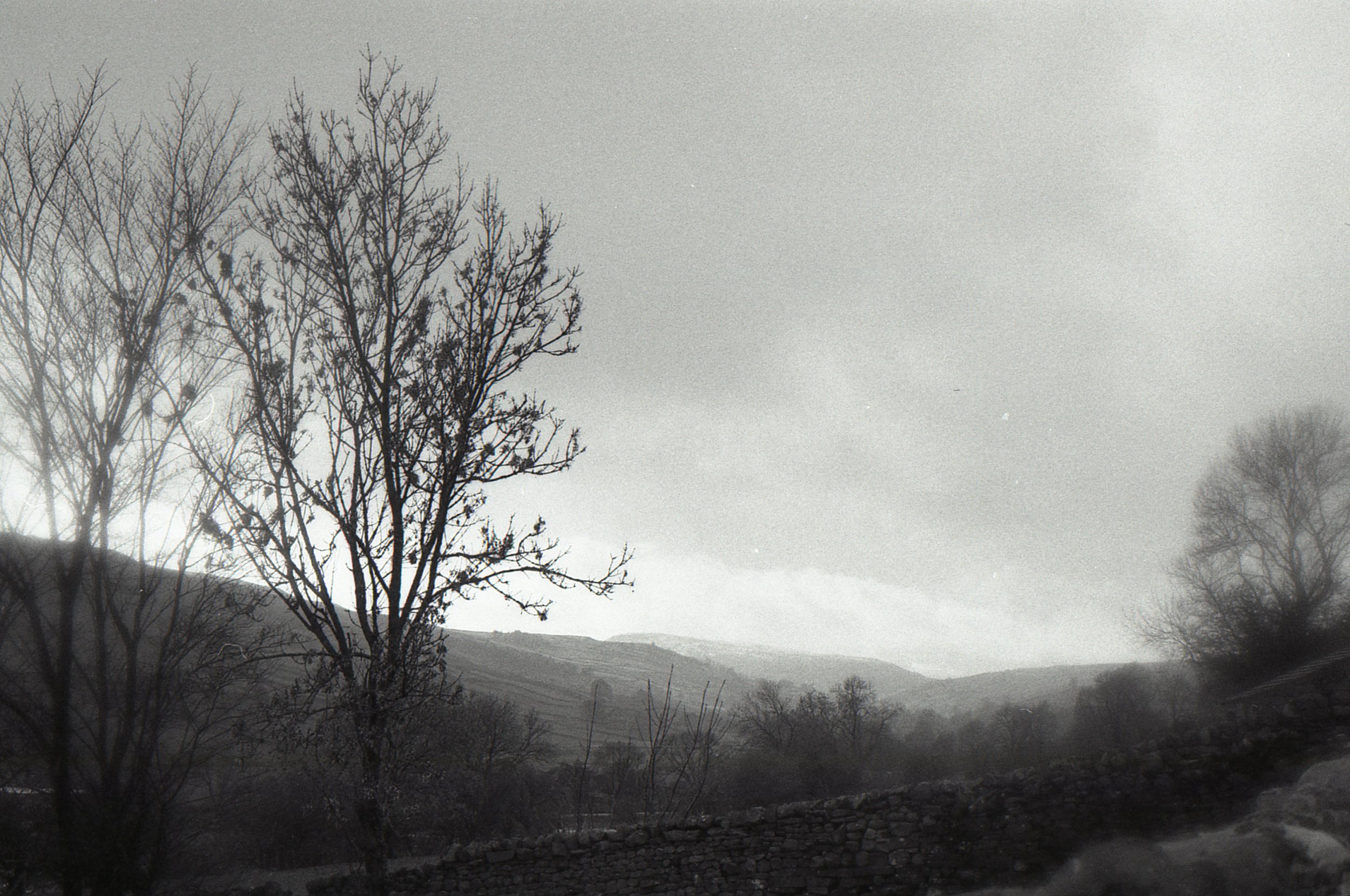
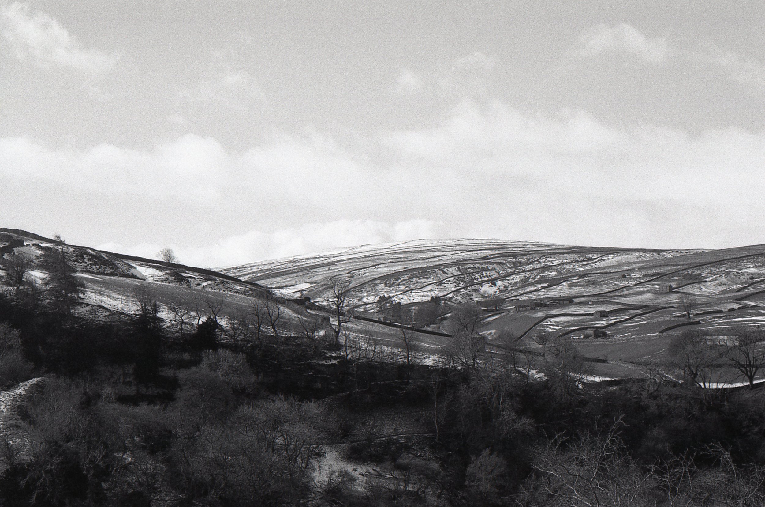
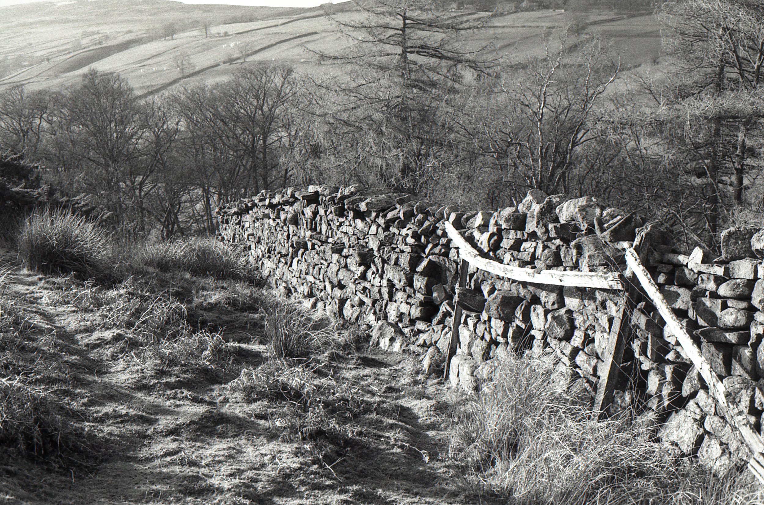
After sharing Kodak’s TMax 400 film last week, today is the turn of Kodaks Tri-X 400 - and my initial thoughts from this first film are WOW! Look at the way its captured the light in these photos. And unlike the TMax 400 - I didn’t need to edit these photos after scanning them, I didn’t even tweak the contrast… which I am amazed about because I’m a confessed contrast tweaker when | scan films.

Compared to the TMax 400, the Tri-X 400 has a stronger contrast, which is definitely helping with the gorgeous light here and I find the contrast really pleasing. After doing a bit of research and looking at other peoples photos with these two films, I thought I would prefer the TMax - as it does have a lovely grain and I love the mid tone greys as I mentioned last week.

img186.jpg

However, now that I’ve used it myself, I’m finding that this film perhaps reflects my eye and vision more than the TMax 400. As much as I would love to be a fine grain photographer and someone with a sharper style, my true love is capturing light and these photos have such a lovely quality of light to them that makes my heart skip a beat.

On one hand the views like the ones above in Keld - are an easy sight to take glorious photos of, but on the other, if I’d used a different film then perhaps it wouldn’t have been captured as wonderfully. I definitely prefer these to the ones taken on my phone (which I guess isn’t really a surprise to anyone lol).

I’m looking forward to trying more of both films to see if my initial thoughts are reflected in different situations and in different places.

Film: Kodak Tri-X 400- sent to me by Kodak Alaris and developed by The Latent Image (not for free, I would just highly recommend them)

Location: Around the Yorkshire Dales, take me back!
Camera: Canon EOS 750.

p.s. its very bizarre to be sharing photos of snow on the hills after the glorious weather we’ve been having lately!
SHEEEEEP

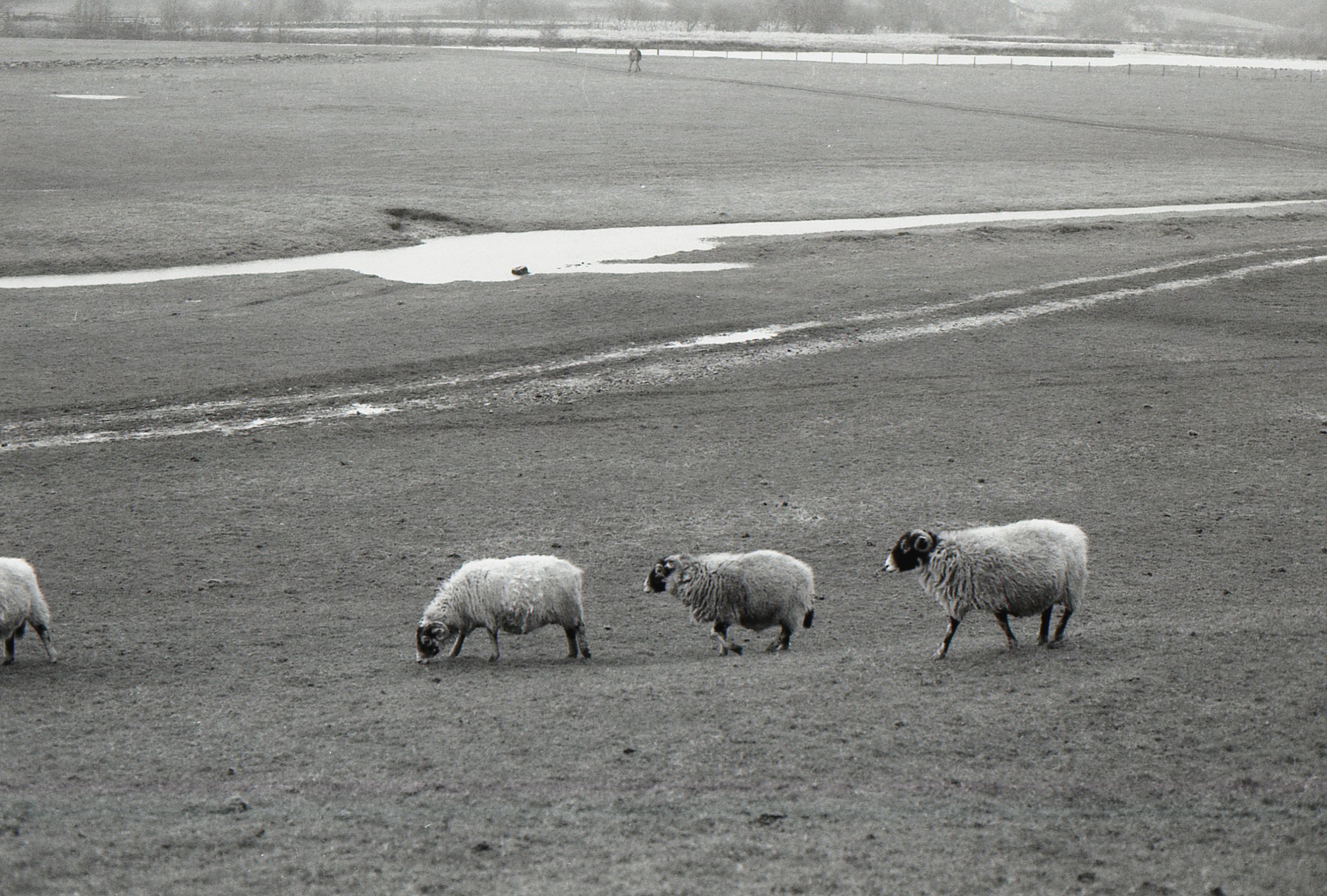
Have I ever told you that I love sheep? I know I’ve shared sheep photos before, but have I ever specifically mentioned that I love sheep? I don’t remember. But if you didn’t know - then you know now haha. I don’t even know what it is about them, but Spring with all the lambs - I love it. Though the lambs were too little when we were in Reeth this time and all in the farms rather than out in the Dales.

Can you spot the sheep in the last photo? It looked much closer in real life, so I’m a bit sad its so small here but its still pretty cool.

Film: Kodak T-Max 400 - sent to me by Kodak Alaris and developed by The Latent Image (not for free, I would just highly recommend them)

Camera: Canon EOS 750
Location: Reeth, Yorkshire Dales

Scanning Kodak T-MAX 400

I mentioned in my last two posts that the results straight from my Epson V370 photo scanner when scanning the Kodak T-Max 400 film from Kodak Alaris ended up being different from the edit that I made to the photos. So I thought I would share the comparisons and the initial scan versus the changes that I made. I don’t often talk about scanning as I find it a little bit laborious - but the truth is that its totally changed my outlook on film photography - and its changed my photos too.

For the first six years of my film photography journey I was very reliant on who was developing my films and scanning them - and at the time I didn’t even realise how important that was. But now that I scan my own, I know there is a whole added step to getting from an analogue negative to a digital image. So lets explore that step and what I’ve done with Kodak’s T-Max 400 film today.

The photos on the left of the cool swipe feature that I just discovered are the original scans from the scanner using the Epson scan automatic settings for black and white film. As I mentioned in my last post - you can see a really lovely gradient of the mid greys that this film produces - and overall, they are still nice photos, with a fine, smooth (almost romantic I think) grain. In fact, many people might be quite happy with those as a result. However, I definitely prefer my photos to have a stronger contrast, its something I tweak fairly often with colour and black and white film.

The right photos to me now seem to jump from the screen - the amazing bird sculpture in particular is thrown forward so that you can’t miss it and the depth of field in the background with that lovely blur, seems even further back. Some would argue that in upping the contrast I do lose some of the detail in the images - but what good is that detail when the overall image seems flat and unfortunately, a little bit forgettable because of that. I’m OK with the trade off.

So there you are - a visual of how different the film looked when scanned to how I edited it - I don’t think its actually that much but what do you think? Would you edit the left images as well or leave them as they are? Do you scan your own films and if so, how much do you tweak your photos after you’ve scanned them?

Film: Kodak T-Max 400 - sent to me for free by Kodak Alaris (thank you so much!) and developed by The Latent Image (not for free, I would just highly recommend them)

Camera: Canon EOS 750
Location: Reeth, Yorkshire Dales

Little Details around Reeth

Whilst we were in the Yorkshire Dales for a few days we stayed in the village of Reeth - which for a small village has three pubs which still makes me smile. Yes we tried them all, and they were all great. I love a Yorkshire pub.

Anyway, as I was using Kodak’s T-Max 400 film which claims to be “The sharpest, finest-grained 400-speed black-and-white film in the world” I figured the best way to test this out would be to focus on my favourite little details and see how the film coped with those.

img122.jpg
img127.jpg
img128.jpg

I think its safe to say that T-Max 400 does have a lovely grain to it which compliments the depth of field in the photo above rather deliciously.

img130.jpg
img123.jpg
img121.jpg

I really love how the film captured the light really wonderfully too and the delightfulness of the old signs (I’m such a sucker for those). I tried to find photos with textures, light and a variation of tones to really put this film through its paces and I’m really pleased with the results and that the nuances in the grey tones came out. On initial scan, the film felt quite flat, which I think was more a result of the automatic Epson settings than a result of the film itself, so I was very relieved when the film found its depth through some small tweaks.

I’m not sure what the technical term for this would be for film, or if there is one - but in lighting (I’m a lighting designer too) the ability of a lamp to show the colours within a scene depends on the colour rendering index number. I feel like this film has the ability and finesse to capture a large variation of mid tone greys that I haven’t quite seen in other films I’ve tried (admittedly I haven’t tried loads) even my beloved Kodak BW400CN drew me in by its contrasting darker and lighting tones. And although it seems funny to get excited about mid greys - grey is grey right - when you think that a black and white photo is essentially all grey (with true black being nothing and true white being all colours) then the importance of being able to show as many greys as possible seems quite important for a black and white film haha.

Did I just accidentally get technical? Is there a technical equivalent for colour rendering in black and white film? Is film indexed that way like lamps? I have no idea! Anyone?

Film: Kodak T-Max 400 - sent to me for free by Kodak Alaris (thank you so much!) and developed by The Latent Image (not for free, I would just highly recommend them)
Camera: My fave Canon EOS 750
Location: Reeth, Yorkshire Dales.